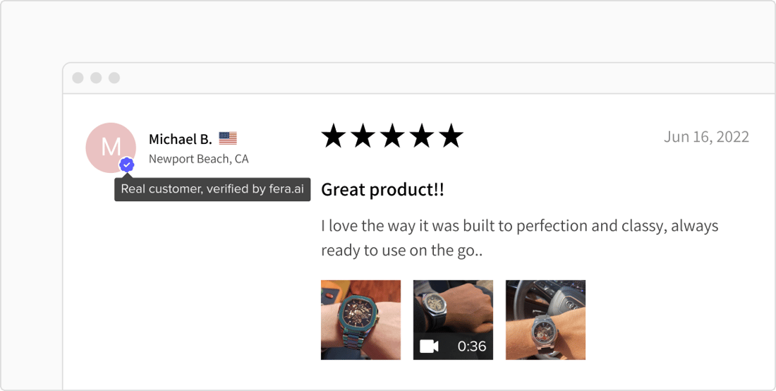
We just released an update that changes the way the customer verifications look on your review widgets.
The new design is meant to look nicer in your theme and be more recognizable by customers so you can maximize your conversion rate!
A New, Nicer, Neutral Design
The new design uses fewer colors and looks better in most store design themes without any additional customization work.
A nicer design means more trust from customers, which means more sales.
A More Recognizable Global Standard
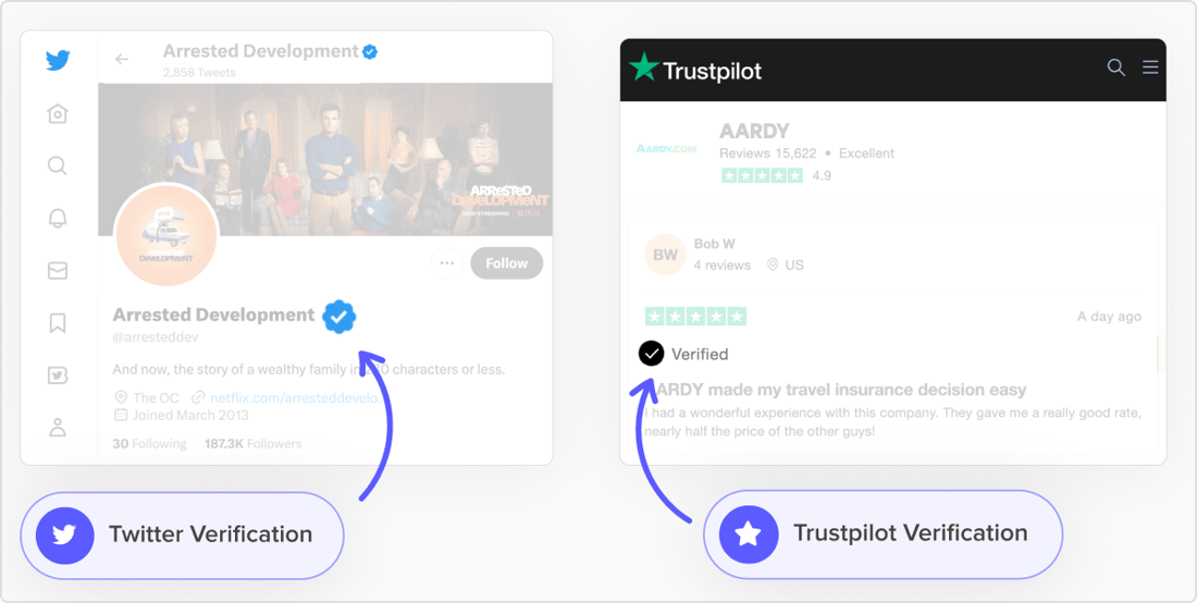
Due to recent changes from Twitter and Facebook, black/blue checkmark icons have become a universally recognized design affordance that customers recognize.
More Trust = More Sales
In our studies we found that customers recognized our new verification icon design far more as “verified” than our previous design.
More understanding of its meaning equals more trust from customers that your reviews are real, which means more sales for your business.
No Action is Needed for Existing Merchants
We rarely make mass updates to storefront content like this, however this was a rare case where being consistent across all stores means more trust from customers.
If you don’t like this change please let us know and we’ll talk about your options.